Style guides provide stability and cohesion across a website and brand.
By maintaining all of the website’s primary elements on this single page, we can see:
- How modular components can be reused.
- How changes to those elements will affect the site overall.
This style guide also serves as a curated, archival collection for design and UX decisions made during the course of this site’s development.
Contents
Values 💯
FLAIR 👩🏻🎨
Uniqueness, hand-drawn elements, originality, personality.
UNITY 🍩
Diverse, inclusive, accessible.
GRACE 🦋
Trustworthiness, simplicity, balance, elegance, harmony, calmness.
FREE 🦜 🐒
Expressive, playful, bold, fun.
A note on emojis: We do sometimes use emojis to support the communication of specific ideas, like the values above. We use them sparingly because they can influence the accessibility of content. There is some helpful guidance on the use of emojis in this guide.
COLOUR PALETTE 🖌️
Colours were selected using the Coolors web app:
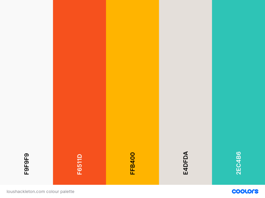
The body text colour is not shown in the swatch above. It is dark grey #302E2D.
The colours were tested for contrast using the WEBAIM contrast checker. The body text colour passes when used on top of both of the two neutral background colours. The body text colour also passes when used on the yellow and the green.
Note that the body text colour does not pass on the orange (and the neutral white shade does not pass on the orange, either).
Colorsafe.co can also be used to check contrast, and this palette in on the coolors website can also be viewed with filters to simulate different types of colour blindness.
Button Colours
Button colours are yellow with grey text, green with grey text, or white with dark grey text. Buttons are animated so that they change colour when desktop users hover over them and when smartphone and tablet uses click on them. This gives the user visual feedback that they have selected a button. At the moment the two coloured buttons change to orange but I might change this to white so that they pass accessibility contrast checkers even on hover.
YELLOW OR Green, turning to GREY on hover
**This content isn’t working right now and I need to fix it.**
White with grey text and border, turning to SOLID GREY WITH WHITE TEXT on hover
Typography Colours
Almost all typography is the dark grey body text colour.
Where text is white, it is used on the dark grey colour.
FONTS 🔤
Fonts were selected with the FontPair web app. Both fonts are sans serif for ease of reading and a less formal look. One of the fonts has a hand-drawn feel to reflect Lou’s drawing and writing style.
Body Text
The font for all body text is Open Sans. It looks like this:
ABCDEFGHIJKLMNOPQRSTUVWXYZ
abcdefghijklmnopqrstuvwxyz
0123456789
Headings and Button Labels
The font for all headings and button Labels is Gloria Hallelujah. It looks like this:
ABCDEFGHIJKLMNOPQRSTUVWXYZ
abcdefghijklmnopqrstuvwxyz
0123456789
HEADINGS AND BUTTON LABELS ARE ALWAYS IN UPPERCASE.
HEADINGS 🎩
The main heading for each page is taken from the title of the page – see ‘Style guide’ at the top of this page. It should always be uppercase. Using the title of the page as the main heading means that each page follows the consistent approach of having a faint line under the main heading.
H1 – the H1 is the page level or section heading
The primary header is a H1 header (advanced header block in Kadence). It may be used for any form of important page level header. More than one may be used per page – like on this page. Consider using a H1 header unless you need a header level of less importance, or a sub-header to an existing H1 element.
[PRIMARY HEADER]
H2 – the H2 is the sub heading
The secondary header is a H2 header (advanced header block in Kadence). It may be used for any form of section level header. More than one may be used per page – like on this page. Use this header if you need a sub-header to an existing H1 element. You can see it used above under ‘Colours’ and ‘Fonts’. It could also be used as a subheading straight after a page level or section heading (H1).
[SECONDARY HEADER]
H3 – is a third level heading
The header above is a H3 element, which may be used for any form of page-level header which falls below the H2 header in a document hierarchy. It could be used for a sub-heading for sections that make up a piece of content that already has a H2 header, for example.
SPACERS ✂️
Spacers are used to create white space and a visual cue between blocks of content on the same page.
- Spacers between primary content blocks are 100 ☝️
- Spacers between secondary content blocks are 50 👇
Other spacers have design elements:
The circles are used between blocks of content on the same page:

The stars are used to mark the bottom of a page:

ICONS, symbols, and small illustrations 🔣
The icons that can be used on buttons are available in the button options within a Kadence button block. They are usedl to show that a link will open in a new page, or to reinforce the differences between two buttons that are side by side (see this in action on the home page).
Icons should be simple and have clean lines.
Where possible, icons should have a hand-drawn feel.
Possible sources for icons that are not hand-drawn or included within the Kadence block settings: This collection of icons from Hand Drawn Goods.
The Noun Project offers free use of certain icons if credited and has a paid option too for icons that can be used without credits.
Small illustrations are used to bring the content alive, and a sense of personality to the page. One example of this is the lightbulb on the homepage.

CONTENT
When creating content for the site, keep an eye on the purpose of the communication:
– What are you trying to communicate?
– Is it best serviced by written content, an illustration, a photo, or a video?
IMAGES 🖼️
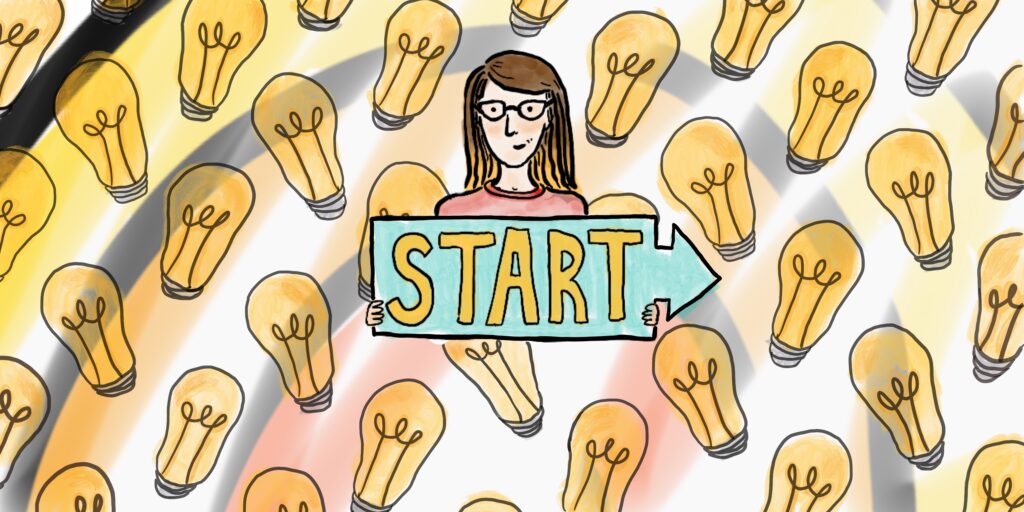
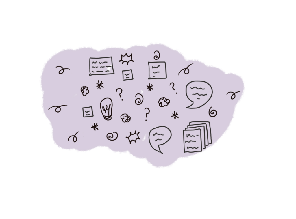
Images are a powerful way to communicate the loushackleton.com brand identity. Wherever possible, images should be:
– Hand drawn doodles by Lou – examples above.
– Real images of frameworks, workshops, events, or other content – Lou will have copies of these.
– If stock photos are needed, use Pexels or other inclusive image libraries such as Getty’s.
Additional inclusive image libraries can be found through the Conscious Style Guide mentioned in the section on Accessibility.
Illustrations and photos that are used are compelling and reflective of the energy and values behind the brand. The following examples show photos we have used are from pexels. Most images depict people or nature. If photos are of objects, there should be something human in the frame.


Basic photography guidelines 📷
Photos that are used:
– Appear and feel natural, clear, and warm.
– Have had their composition deliberately planned with a single focal point.
– Are quality images that are either taken specifically for their purpose or chosen from an inclusive image library.
COMPOSITION

- Clear and specific about its subject.
- Free of busy background or foreground noise and clutter.
- Ensure subjects reflect the diversity of the human race and experience (see Getty Images Diversity and Inclusion Collection, and Pexels – the world’s first inclusive free stock photo and video library).
TONE AND MOOD

- Simple, direct, honest.
- The subject is well lit.
- Embodies the brand values: flair, grace, unity, free.
STORYTELLING

- Tell genuine stories appropriate to the context.
- Recognisable environments and / or elements.
- Contribute to and support the narrative in order to enhance comprehension.
ACCESSIBILITY and inclusion 🌈 ✊🏿✊🏾✊🏽✊🏼✊🏻✊🧑👂☝️👄
loushackleton.com aims to support and promote accessibility and inclusion through the use of alt-text, inclusive image principles, inclusive writing, and other forms of inclusive content. Here are some helpful resources to support this aim. This is not intended as an exhaustive list so if there is a helpful resource you’d like to see added here, please let Lou know.
ALT-TEXT 📖
Use the WebAIM Guide to Alternative Text to ensure images are accessible to those with screen readers.
Emojis
Emojis can have a negative impact on accessibility, if overused or used incorrectly. There is some great guidance on how to use emojis in a way that’s accessible for everyone from the tiny blog.
IMAGE PRINCIPLES 🖼️
Use the WebAIM Guide to Images to ensure images are accessible to those with visual impairments and those who are vulnerable to seizures.
READABILITY 🔖
Follow the Content Design London Readability guidelines.
STYLE, SPELLING AND GRAMMAR 📋
Follow the Government Digital Service style guide.
tone, voice, and writing for different types of content 🎤
Follow the Mailchimp Content Style Guide.
INCLUSIVE CONTENT 🙋
Use the Conscious Style Guide.
